Showing posts with label Critical Debates in Design and Manifesto. Show all posts

Wednesday, 12 March 2014

Task 8 (Sustainable Design)

Earth, a beautiful planet has so much to offer. It has always been providing us with the resources we utilize for production. However, How much longer can we keep taking? Is it right to take without compensating? What about depletion? What about landfills?

Landfills are such a problem, the bigger problem is the fact that not everyone is aware of the plight.

take a look at this list of materials, and how long it takes them to decompose in a  landfill....

How Long does it take to Decompose 
Paper Towel - 2-4 weeks
Banana Peel - 3-4 weeks
Paper Bag - 1 month
Newspaper - 1.5 months
Apple Core - 2 months
Cardboard - 2 months
Cotton Glove - 3 months
Orange peels - 6 months
Plywood - 1-3 years
Wool Sock - 1-5 years
Milk Cartons - 5 years
Cigarette Butts - 10-12 years
Leather shoes - 25-40 years
Tinned Steel Can - 50 years
Foamed Plastic Cups - 50 years
Rubber-Boot Sole - 50-80 years
Plastic containers - 50-80 years
Aluminum Can - 200-500 years
Plastic Bottles - 450 years
Disposable Diapers - 550 years
Monofilament Fishing Line - 600 years
Plastic Bags - 200-1000 years


This list has been taken from here.

So do I believe that we are responsible citizens of the world? 
Yes I do, of course. 

A designer's job is slightly different than what it used to be. Today, a designer must not merely come up with original and creative signs that serve the purpose, but must also think of ways to design without further depleting the natural resources, or destroying Earth with landfills and toxics.


Ethics in Graphic Design is an interesting simple website where you can read about sustainability and other topics regarding ethics.

Tom Dixon, in this short amazing video talks about ways to do so. He talks about various interesting elements, but these two are simple and useful for our planet. 
  • We can collect usable materials instead of constantly constructing new ones.
  • We can utilize bamboo more often, as it quickly grows and is a very strong material.


I personally wish to start using recycled paper just to support these companies more, and encourage actions that can be beneficial for the world.

I found this website, where you can purchase various types of printing paper, some of which are 100% recycled. The company is Premier Paper Group. There is also The Green Stationery Company. I am hoping to find a company that sells various interestedly textured papers rather than the original colored ones. I would love to use them for my business for design project.


Wednesday, 5 March 2014

Task 7 (Ads!)

Before I start talking about anything, please (if interested of course), watch this ad. One of the best I've ever seen so far....very touching

http://www.youtube.com/watch?v=OAlyHUWjNjE

Introduction:

What is right? What is wrong? To be honest, I do not have a fixed opinion about ads. Ideally speaking, in my opinion, an ad should send a message about an idea or a product across to the audience. It could have several intentions; promoting a great product, persuading people for an action. Whatever the purpose is, in my opinion, it should be honest, and it be as creative as can be, but must not often the general public in any way.

However, an ideal system is easy to talk about, but never easy to apply. The reason why I'm saying that is because of the following questions that I ask myself:

Who decides what is right and wrong?
Who decides where the red line should be drawn?
What if only a minority gets offended?
Should minority rule just the way the majority does?

...It's kind of like democracy, it is easy to talk about it but no country applies it ideally...

Even the ad that I have posted in the beginning. Would it possible for someone to stand up and say that it is inconvenient to screen this ad because graffiti art is illegal?

What do you think?

Check this out...it is an MTV ad that was banned by the US government...do you think it was right to do so?


This Nivea ad was also banned, as it was claimed that it misleads people, promoting the product with exaggeration as to how much it creates an effect of the skin.


However, I do believe that a bit of odd humor can stimulater he audience...watch this Pepsi ad..
http://www.youtube.com/watch?v=40DykbPa4Lc

Guerrilla Marketing:

http://www.creativeguerrillamarketing.com/what-is-guerrilla-marketing/

Guerrilla marketing is a strategy used to promote ideas or products unconventionally. Although it was created for smaller businesses that cannot afford to pay too much money for conventional, big companies do it as well. As you can read in the article, Red Bull utilizes this strategy through Felix's skydiving jump. This can also be considered 'viral advertising' as it creates a buzz through social media..


Although hard to achieve, an ad must be honest, and can be creative and humorous as long as it does not often or trick people....but then would most of the existing successful survive?


Wednesday, 26 February 2014

Task 6 (Packaging)

Packaging is obviously a key field in graphic design. It's everywhere. It is involved in every kind of market. Today designers are aware that our Earth has been filled with wastes. The consciousness is growing, as a designer's job is no longer plainly to design beautiful packages, but these packages must be more practical, cheaper, consume less resources, and easily recycled or reused, thus comes the term 'Green Packaging'. And as you can see these days brands who want to prove themselves worthy to the consumers use slogans that may relate to the environment such as 'think green' or 'go green'. How much energy does it consume to implement a design? How much carbon footprint does it require? Carbon footprint is an essential element that refers to the gas emissions that get sent to the atmosphere.

A material that I'm fond of is cork, which has many positive attributes to packaging.
It is water proof, light, pretty, biodegradable, which is enough for me to appreciate.

Check out this website, from which I got this picture, and where you can read about cork and its uses.


Another term known as 'traffic light labeling' is utilized to indicate how healthy the proportions of the food are using colors. The colors are commonly red, yellow and green. Red is unhealthy, green is healthy and yellow is in between.


There is also energy label, for example, there is the European Union Energy Label.


I found in interesting website through which you can find carious package designs with environmental considerations taken. 


Monday, 17 February 2014

Task 5 (Analyze two designers/design groups that work with ethics)

Jimmy Nelson

Born in 1967 in Sevenaoks, kent, he started working as a photographer in the year 1987. His interest in photography became alive not merely for career purposes. In fact, it all began when he set off on a journey in the hopes of finding himself in Tibet. On this journey, he became good friends with his camera, and eventually felt incited to further scrutinize and explore the areas he visited, and was eager to do the same around the world. Eventually, he created an ethnographic photographic documentation, which was published in his book 'Before They Pass Away'.


Inevitably, with such a task at hand, experience comes along. In his speech, he ushers three key lessons he has learnt on his journey.

Lesson 1: Things are not always what they seem to be. "You never know what's around the corner", he states, and urges the audience to look deeply at the people around, as prejudice is easy to fall into.

Lesson 2: No matter where you are, if you come to understand yourself, and cart living in harmony with the environment, you will gain an understanding off hat makes you happy. In addition, no matter where you are, in life, you have choices to make about what makes you happy.

Lesson 3: Demolish the walls that separate you from others. This will help you communicate. Once we lose these cultures, we lose a part of us that once held our authenticity, our origins. Different cultures we may come from, but we can learn from each other.

This is a photograph of a person from a tribe called Maori (North Island).


All of this information and photos have been taken from a Jimmy Nelson official website. 


Now we may or may not all agree that these cultures are ideal and appealing. Modern life has convinced us that early cultures hardly have anything to offer. In fact, before watching Jimmy Nelson's speech, I was prevailed upon that myself. However, being what we are today, and judging others the way the majority of the societies do today, what had we done? Certainly nothing positive. We lost passion, we destroyed the natural resources. We find ourselves superior, and underestimate the glory of deviant thoughts and ways of doing things. This additionally led to many wars and lack of empathy towards people that we find alien. Hence, I truly appreciate what Jimmy nelson has done, and I specifically appreciate the fact that it is love, passion and curiosity that drive shim to do what he does with authenticity, ethics, understanding and devotion. 

Ryan Gibboney

Ryan Gibboney, a visual designer and an educator, graduated from SCAD and earned her MFA at Purdue University. Her teaching philosophy suggests so much positivity about her design ethics.
She is credible that design duration has the tendency to impact both the designer and the community. Design should support what society needs. It is a designer's responsibility to think of ways to create solutions that are sustainable and comprehensive to provide society with its needs and safety.


Read more about her on her official website.  


Sunday, 9 February 2014

Task 4 (CSR - What is it? How would you integrate it in your business plan?)

Corporate Social Responsibility

- When a business runs parallel with social, ethical and environmental considerations. It is fair to say that if only businesses integrated CSR in their plans, communities would be much safer, knowledgable and sustainable.


As we saw earlier in class, CSR is not exclusive to graphic design, but rather a factor that could be common in all in fields of expertise. Read this post to gain an understanding of CSR:-

http://www.corporatewatch.org.uk/?lid=2678

Be it political, social, artistic, scientific or any other field, with no responsibilities, the community would suffer. This is why many journalists decide to report the news individually, as many (if not most) news agencies might force racist, or rather biased policies over the journalists. This can be done by spreading false information, emphasizing certain events, and minimizing others. Read this article to gain an understanding of how CSR can be integrated with the construction industry, by Paul Bryant.

http://www.greenbiz.com/blog/2014/02/06/10-csr-ideas-retool-design-and-construction-industry

In Design

Should a designer compromise his/her beliefs for a design job?
- In my opinion, not every person has the luxury of flexibly molding a job to his/her beliefs and ethical standards. However, as much as possible, one should work based on one's personal ethical standards.

Examples of companies with a positive reputation for CSR

When I asked to give examples of companies with a good CSR policy, I could only think about the media and brands that I am exposed to. I thought about the 'Body Shop', who constantly bring up their disapproval towards animal testing.


http://www.thebodyshop.com/values/AgainstAnimalTesting.aspx

I thought about the bands that I listen, those whom I believe work with passion, integrity and responsibility, which is suggested through the lyrics, and the personal effort each band member puts into the music production.


I have a very basic idea of what a company should have in order to be considered as a company with a good CSR. However, I was not sure which companies function this way. Hence I decided to browse the internet. On more than one site, I found the same redundant names. Microsoft, Google, BMW and Walt Disney.

Mircosoft is ranked as the number one company with a CSR program. It is well reputed for several elements; employees, environment and revenue. It reduced it's carbon emission drastically.

It is interesting to me however how a company may seem very ethical at one thing and lacking in another. For example, Google is known to be one of top companies that functions with CSR in a sense that the employees are treated without short comings. In fact, it is ranked as number 3 for its CSR. Their well being is always taken into consideration. In this regard, Google does have a renowned CSR. However, what about privacy? Why did its rank fall in 2011? Many people are not confident with having their privacy secured....Many of my friends decided to quit using Facebook, claiming that it lacks privacy security...Thus, it is logical to say that different companies may have different ways of establishing CSR.

This is Google's website....the working environment is tempting ;)

https://www.google.co.uk/about/jobs/lifeatgoogle/

Read these links below for more about what I have mentioned...

http://www.forbes.com/sites/jacquelynsmith/2012/12/10/the-companies-with-the-best-csr-reputations/2/

http://www.marketingweek.co.uk/news/microsoft-has-best-global-csr-reputation/4008108.article

http://www.developmentcrossing.com/profiles/blogs/top-100-csr-companies-by-reputation-2013

http://www.environmentalleader.com/2013/10/17/which-companies-have-the-best-csr-reputation/


My business Plan

1) Art
2) Graphic Design
3) Messages

I plan on working on things that I am passionate about; it makes me more naturally devoted. At times I create artworks that have a specific meaning. In addition, I sometimes write poems, or simply ideas andy thoughts that I hold dear tom myself, and many are those that I feel I should spread...they are important; simple, but not everyone is aware of them. I must say I am inspired by Russell Bran's approach of boldly talking about issues that he feels are important...simply the fact that he advocates love means a lot to me. Since my undergrad years, I have had an interest in public speaking, so I wish to pursue that.
Social networks are also key to CSR in my opinion. It is fast, and reaches people globally without much to pay for.


Sunday, 2 February 2014

Task 3 (Moving Images)

Filmmaking and Animation


It would be easy for me to simply claim that we have had a long rich history of filmamking and animation, and that these two fields of production have a long life ahead. However, I needed to remember my dates, and look up at a brief history of the two in order to put my claims and facts into perspective.

These two sites gave me a beneficial, clear and interesting history of filmmaking and animation.

http://www.youtube.com/watch?v=BKJqeJ48CPs

http://movies.about.com/od/animatedmovies/a/history-animated-films.htm

After reading those, I became aware that many contributors worked in order to give us what we have today in the movie industries. Since the 1500s, Leonardo da Vinci explained the idea of 'Persistence of Vision', and from then we have had many inventors who collaborated to create what we know today as animation, leaving us with the first publicly presented computer-based animation movie 'Toy Story' in 1995.

Clearly, we have seen many advanced animated productions in video games and movies. I am pretty sure we all know 'Avatar', which became renowned not for the new story plot, but for the intricate details in the animation, and how it appears to be something real.

These days people talk about the popularization of 3D movies and holograms....All of these things make me believe that we still have so much ahead of us. The styles we embrace may differ from season to season. But years ago no one ever thought people would have cinemas in their homes, but many people take it for granted these days.


Moving Images 


Last week we looked at moving images, specifically those created for movie titles. For this assignment, I referred to all of the various movies I have watched.


This film title is for the movie 'Orphan', created by Ryan Robertson, who has a long list of film titles on his resume, including 'Catwoman', '300' and 'Twilight'. 

In relation to last week's discussion, the reason why I specifically selected this film title is because it creatively represents the elements in the movie. It is graphic, with typographic animation that exemplifies the antagonist's behavior. It is grungy, dark, and gives flicks of the story plot. 

The interesting part of moving images is that although we have a long history of it, it is still relatively young and has many blank pages left to be filled by the upcoming generations of designers. Moving images have been evolving into more complex productions, from 2D to 3D and with ever so expanding techniques.

This is an interview I found of a renowned Pixar director named John Lasseter, who is credible that animation will keep expanding and will persistently prevail in the world of movie making.


Tokyo Plastic

Tokyo Plastic is one of the 20 design groups that I mentioned for one of our previous tasks. Its members have produced animations for various clients, and devote a lot of their time designing characters. 

Their website is here:


This video is very brief, but you can listen to one the members talk about the design group and what they do. 

Tuesday, 28 January 2014

Task 2 (Environmental designs)


Out of Kinnington Station, I randomly walked to see the area around me and came across Strata. This project isn't complete yet, but I appreciate the idea that one can easily spot their location although they haven't used the globally known signage system such as arrows. They depended on size and the location of the logo.


Clearly states the timings at which it opens.


I carried on walking on my way to the University of London, and I stumbled upon this building known as the 'Friends House'. 


Finally, I reached the gallery building that I was hoping to see. 


Despite the fact that the gallery was professional and interesting, I am credible that the signage system couldn't have been more harmonious with the gallery. It is very clear, but none the less it doesn't look professional. It wasn't well thought of, as though someone just stuck regular A4 papers with arrows, which will tell us the way, but it certainly does't create a nice image within the gallery that will be attended by many students and other guests from various countries. This gallery was a mixture of photography, graphic designs and videos, so the signal system could have been more creative to represent the atmosphere. 


This is what it looked like outside the gallery room.


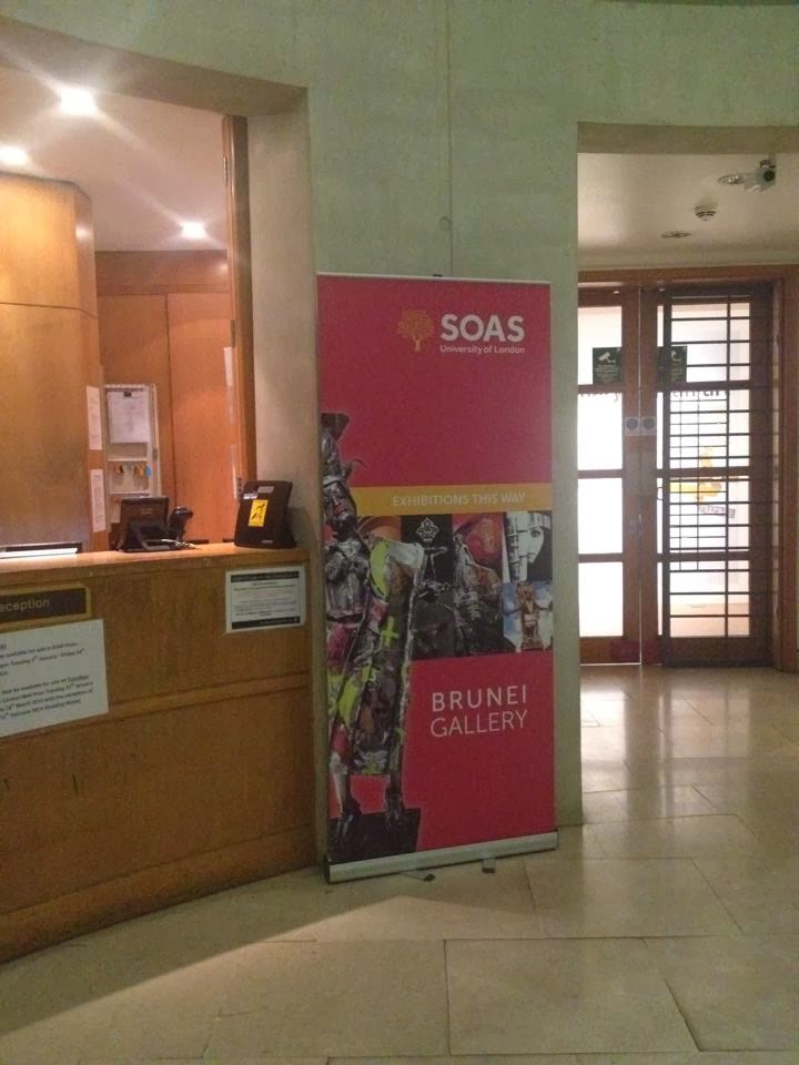
SOAS is practical with way finding in a sense that you will easily find it around the streets. It has these banners across many areas of the streets, making it easily possible to flow them all the way to the building. Moreover, the posters and banners are collectively consistent and appear to be coming from the same entity, which is important for an identity. 


PrĂȘt A Manger


Designed by: The Foundation Creative Consultants Europe LTD

Adrian Kilby founded the Foundation in 1994. This design foundation designed many award winning identities. They won several awards for the identity creation of Pret from various authorities including New York Festivals and London International Advertising Awards.

Pret A Manger is expanding globally, scattered throughout the UK, the USA, and the Far East. Unlike many fast food restaurants or shops that produce ready-made meals, Pret is well reputed for its clean organic hand made meals.

General characteristics
The colors are bright, eye grabbing but elegant. The language usage is informal, friendly, with various typefaces that range from italic to straight sharp capitals. The typeface is specific to Pret, which is tall and bold, and that implies their confidence of the quality. Nothing looks serious, as it is meant to be inviting and mentally comforting for the costumers.

Organic:
A major characteristic of Pret is that the food is organic. This is conveyed through the posters that are framed with the wooden architecture that stretches throughout the interior of the restaurant. The posters are modern; they contain a lot of negative space, which makes the poster clean, easy to read and eye grabbing. Consistently, in the center of every poster, different kinds of foods are juxtaposed to create a shape of an organic element. Coffee beans are used for rain, and apples and limes to create a heart shape. Under each demonstration, there is information about their products and from where they are brought. This signifies their confidence in the authenticity of their healthy clean and high quality sources of hand made meals. The interior is a brick wall, with many wooden frames for the posters, which generates a warm, organic and cozy environment.  Signs with casual language are scattered throughout the restaurant. On the exterior of the restaurant, a band of text runs across that indicates what kinds of food one can purchase. 

Like most public displays, the name is name for attraction, with stars to symbolize elegance and high quality.


The green apple and lime create the heart shape, giving the design a fresh, healthy and loving look.


'Organic Fields' is clearly readable on the wings of the butterfly, that is composed of a coffee beans and recycled looking fabric.


The italic font in tis case is used for fluency, and since it isn't related to the logo or the food menu, and is simply a statement to promote the food, is it created with a different appearance in order to stand out.


The typeface is sharper, with huge weight variation in capitals. 


Apparently the informal use of language is displayed all over the restaurant for a friendly reputation.