Showing posts with label Project B (Design Authorship). Show all posts

Sunday, 27 April 2014

Project B (Process and final outcome)

My project B will be a book that consists of my poems, illustrations, and quotes. The topic will revolve around problems in the world, my view, and quotes that will give the reader the idea that although this world is full of abhorrence, there are still people who advocate love and understanding, and that these people come from different religions and cultures.

When I presented my ideas for project B, I was given the following tips and recommendations:

  • My poems and illustrations should be in one book, and the quotes in another.

  • To write down the material with my own handwriting.

  • To create illustrations that are uniform in style and technique in order to create harmony and consistency in the book.

I went back home for holidays, and was thinking about it all the way through...I contemplated on the suggestions, and the realized the following:

  • My thoughts don't come from nowhere. They are made up of my own thoughts, but my thoughts are also somewhat shaped by my environment, people and the things they do and say. Moreover, this book does talk a lot about ubiquitous problems, but it also gives a hint of love through the quotes. Therefore, I did not feel right creating two separate books for the two sections. design-wise, my task of putting them together  in one book was challenge, as the textured background I was planning on having for the quotes differs greatly from the one used for my poems and illustrations. But I was willing to take that challenge as the concept was more complete this way.

  • About my handwriting; you seriously do not want to read it! My 'r's are like my 'n's and my 'f's are never capitalized. It goes all over the place. Moreover, I remember the night before presenting my ideation, I was sitting in front of illustrator thinking, 'Am I really supposed to look through all of these typefaces and select one for my poems?!' Incase you did not know this about, but typography was never my thing. So to avoid any challenge I wrote a few words with my hands and went to class. Is this the solution that a designer must always seek? Well, maybe if you only had a few words to write, or if your handwriting is readable. But in my case, doing it was not the best way out as a designer...so this suggestions was also suspended from my thoughts.

  • Finally, I had to finally draw up more illustrations with ink, as I was convinced with the idea of unifying them for consistency.


So I did that...and began the application journey.

This is how I created the  torn paper texture to separate the sections in the book.

Looking at  my drawings side by side to see the consistency and decide which poem each drawing will go with.

Thought of creating a paper to build a bridge between the sections....


It was coming! However, at this stage I did not like the fact that there was no contrast between the blue and paper
textures.

I was trying my handwriting....I was not liking it.


Back to no text! I was not convinced with my handwriting.

Decided on the typeface...it was time to put the text and illustrations on the pages.

This is better!

Putting the pages next to each and arranging them with the poems helped me understand how many more illustrations I needed to make the book complete.

I thought of creating a transparent paper with a texture to cover some of the pages with text. I thought of using my pastels...It was experimental, but I was not going for it.

I am happier with this...


Started a new drawing... the 'Snake Plant'.

Inked it...
Started another new drawing for the cover...the 'Scarantuly'.


I wanted the cover to be hard, and glossy...

So I did it this way


So, the printing, cutting and sticking is done. But now I must bind it. I would like a spiral bind because spiral books remind me of my note books and sketch books, where my doodles, thoughts and poems are leaked...so to add more depth and meaning to the book, I decided to go for a spiral binding. Some people hate it because it is relatively cheaper. But if you think about it, it is so comfortable flipping pages that are binder with a spiral; you can flip all the way to the back and stare at one page at a time without having to deal with a spine that might bend and crease. 

Wednesday, 26 February 2014

Project B (Ideas and visual concepts)

Introduction

My general outlook for this project will be opposite of that of the 'Blooming Mind'. It will look generally dark and grungy. This is because the theme will revolve around my thoughts, ideas, poems, puns, research and artworks about problems that prevail in the world. These problems may be the simpler social complexities that any person may encounter, and it can also be as big as the wars that are raging throughout the glove and probably even include my ideas about secret societies and their agenda. All will be gathered and displayed in a book in a way that will hopefully be as artistic as I  can make it.

Blinding

I am almost certainly sure that for this book I would like to have it done with a spiral bind. Although many people do not prefer it because it looks cheaper, I actually love it and specifically for this project it would be very relevant.


  • For a start it is very easy to flip through without being bothered with ruining the spine or having the book close (with the lower quality glue binding this happens). 
  • It reminds me of personal notebooks, which is a touch I would like to give to the book because the thoughts and ideas I would like to publish are things I think about routinely and I end up scribbling words and doodles around my papers.

Initiative steps and concepts

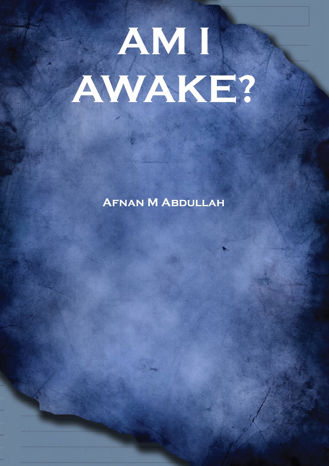
The title I though of having is 'Am I Awake?'; a question that is key, and may trigger the viewer to do the same. Nothing in this world can change to the better unless people collectively wake up to the surroundings. At time you may believe you are  awake, and come to find out you're not. Additionally, it is never easy to simple wake up to clearly and vividly see the world as it is. However, it is always worth the attempt as it is what can make a difference in the world, or least as an initiative stepping stone, it can lead a society to do the right thing.

In this post, obviously the ideas won't be appropriately arranged and the poem displayed won't necessarily be represented with this artwork, but these is generally the dark look that I am aiming for.

I started by gathering my writings n one file, my writings in another (which I will  be showing in class!), and then I started imagining how the cover should look. It must clearly tell the viewer what kind of things will be inside the book. So the first idea that came to me was using the photoshop artwork I created which talks about war.


I started to think that the cover should represent the content of the book, but must not look like the pages inside. Therefore, I am going to use my artworks for the pages, I might have to give a completely different touch when it appears on the cover.


This is by far my favorite cover design from what I have done so far. 

These care sample pages. The reason why I made two versions (different hue) is because although each page will be different, they must speak together and have the general prevailing color. The prominent color that will be used throughout the pages is still undecided.