Out of Kinnington Station, I randomly walked to see the area around me and came across Strata. This project isn't complete yet, but I appreciate the idea that one can easily spot their location although they haven't used the globally known signage system such as arrows. They depended on size and the location of the logo.
 |
| Clearly states the timings at which it opens. |
I carried on walking on my way to the University of London, and I stumbled upon this building known as the 'Friends House'.
Finally, I reached the gallery building that I was hoping to see.
Despite the fact that the gallery was professional and interesting, I am credible that the signage system couldn't have been more harmonious with the gallery. It is very clear, but none the less it doesn't look professional. It wasn't well thought of, as though someone just stuck regular A4 papers with arrows, which will tell us the way, but it certainly does't create a nice image within the gallery that will be attended by many students and other guests from various countries. This gallery was a mixture of photography, graphic designs and videos, so the signal system could have been more creative to represent the atmosphere.
This is what it looked like outside the gallery room.
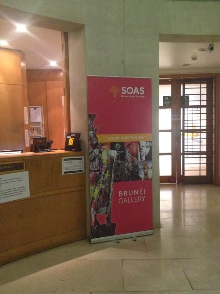
SOAS is practical with way finding in a sense that you will easily find it around the streets. It has these banners across many areas of the streets, making it easily possible to flow them all the way to the building. Moreover, the posters and banners are collectively consistent and appear to be coming from the same entity, which is important for an identity.
Designed by: The Foundation Creative
Consultants Europe LTD
Adrian Kilby founded the Foundation in 1994. This design
foundation designed many award winning identities. They won several awards for
the identity creation of Pret from various authorities including New York
Festivals and London International Advertising Awards.
Pret A Manger is expanding globally, scattered throughout
the UK, the USA, and the Far East. Unlike many fast food restaurants or shops
that produce ready-made meals, Pret is well reputed for its clean organic hand
made meals.
General characteristics
The colors are bright, eye grabbing but elegant. The
language usage is informal, friendly, with various typefaces that range from
italic to straight sharp capitals. The typeface is specific to Pret, which is
tall and bold, and that implies their confidence of the quality. Nothing looks serious, as it is meant to be inviting and mentally comforting for the costumers.
Organic:
A major characteristic of Pret is that the food is organic.
This is conveyed through the posters that are framed with the wooden architecture
that stretches throughout the interior of the restaurant. The posters are
modern; they contain a lot of negative space, which makes the poster clean,
easy to read and eye grabbing. Consistently, in the center of every poster,
different kinds of foods are juxtaposed to create a shape of an organic
element. Coffee beans are used for rain, and apples and limes to create a heart
shape. Under each demonstration, there is information about their products and
from where they are brought. This signifies their confidence in the
authenticity of their healthy clean and high quality sources of hand made
meals. The interior is a brick wall, with many wooden frames for the posters,
which generates a warm, organic and cozy environment. Signs with casual language are scattered
throughout the restaurant. On the exterior of the restaurant, a band of text
runs across that indicates what kinds of food one can purchase.
 |
| Like most public displays, the name is name for attraction, with stars to symbolize elegance and high quality. |
 |
| The green apple and lime create the heart shape, giving the design a fresh, healthy and loving look. |
 |
| 'Organic Fields' is clearly readable on the wings of the butterfly, that is composed of a coffee beans and recycled looking fabric. |
 |
| The typeface is sharper, with huge weight variation in capitals. |
 |
| Apparently the informal use of language is displayed all over the restaurant for a friendly reputation. |


No comments:
Post a Comment