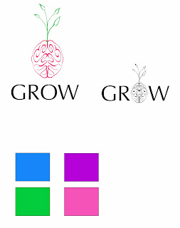
A classmate (Amandaa!) sent me this sketch. The idea it like my initial one...except it has roots added, yet it is much more simplified (which can be useful for logo designing).
So My brain took me from here...thank you ;)
From the looks of the roots I drew, I decided to experiment with different a different typeface. Obviously this one looks much different from the one I experimented with in my previous blog...This one is Optima...it can blend nicely with the flicks and swirls of my sketch.


No comments:
Post a Comment