Exhibition/Museum visits.
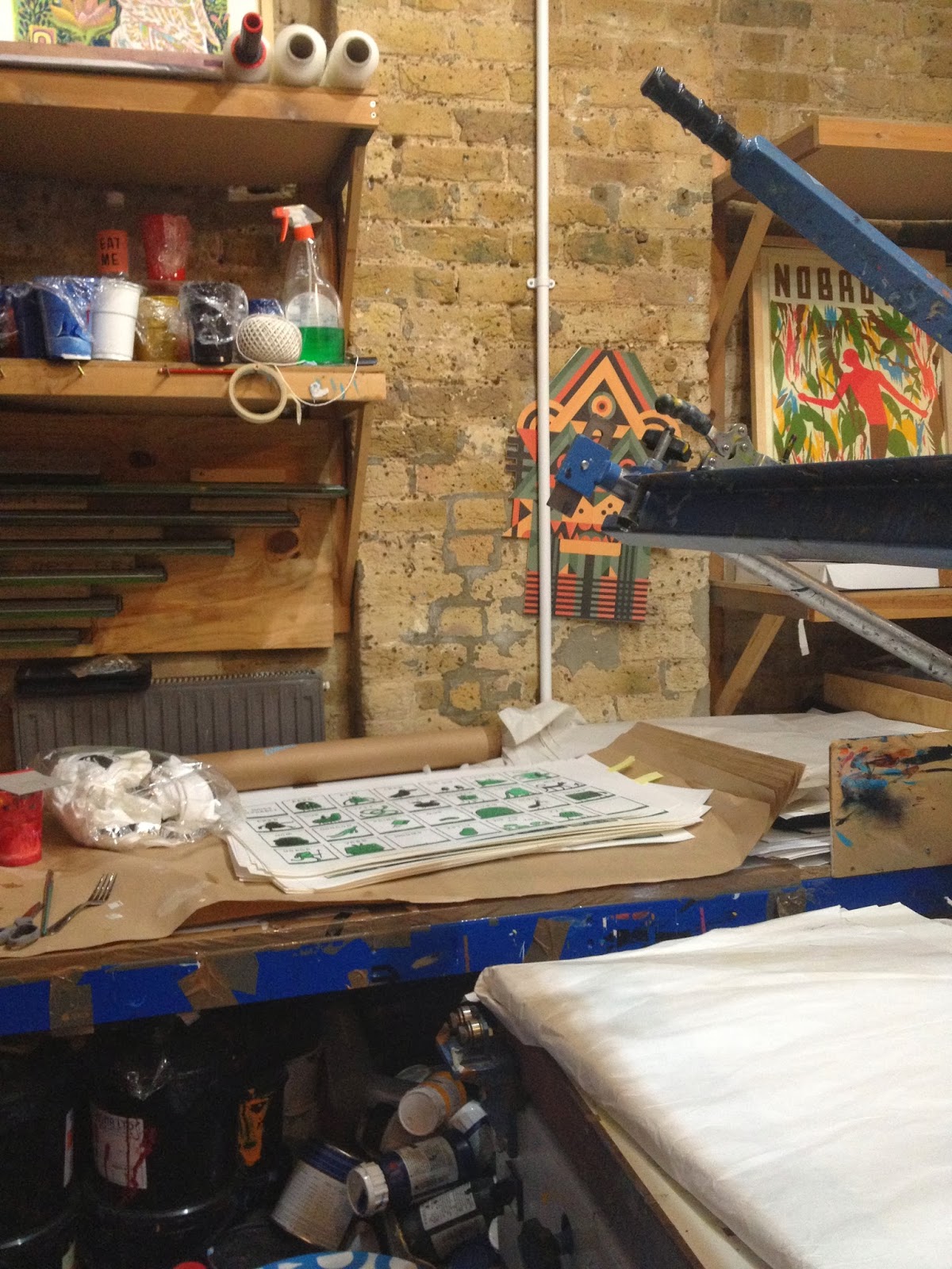
Nobrow: If you fancy illustrations and such careers, then
Nobrow, despite it being a small place, it the place for inspiration. It’s a
little place out of this world, piled with wonderfully illustrated books. The
stunning part is that this company creates the books from scratch. There are
several departments as means of having division of labor.
Everything was engaging, with eclectic colors, topics and
styles. The book that I found the most alluring was the ‘Dragonology’. Trust me, it’s not just because I like
dragons. A witty designer it was that created this book, with pop ups,
textures, die cuts and illustrations implemented innovatively.
Another thing that I found somewhat outstanding is the fact
that Nobrow has no business cards. When I asked for one, I was given a post
card with all of the contact information on it. In a way, it might be unpractical,
as it won’t fit in any wallet. However, in another way it is unique.


North Design: In our first semester so far, we have been discussing
the process of designing, and the phases of research a designer goes through in
order to reach a suitable, functional and sustainable design. The research will
often oblige the designer to dig deep into information about culture, language
usage, typography, colors and more. All such elements must be tailored to the general
preferences of the public in order to be remembered positively. I didn’t think
I would ever see such an exquisite, accurate and inspiring exemplification of
our lectures until I attended Sean Perkin’s presentation about North Design.
If I wanted to take you through his entire presentation, I
would have to write up an extremely long post (which I don’t wish to ;)).
Anyways, this design agency has created numerous designs for many eclectic companies.
Their brand identity creations have been implemented with success. Their
solutions varied from logos to uniform designs. North Design’s website is
currently unavailable due to the fact that it is being updated, but here it is
for you to browse through whenever the update is complete.
Barbican Pop Art Gallery: Although pop art never really
served my interest (a subjective statement), I found things that I believe were
alluring and were an interesting point of art history.
As we all know, Pop Art emerged after World War two. This
art movement is associated with common popular objects such as comics and so,
often implemented with mix media. As designers today we just use the programs
offered to us and often fail to imagine what it was like experimenting with
such devices years ago. This gallery gave me the experience of seeing
productions of artists that were experimenting with design, mix media,
photography and interior design; this helps in understanding how we came to
where we are now.
The first piece I will talk about is John McHale’s ‘Machine-Made
America 2’. Creating collages as means of expression was becoming pervasive in
the 1950s. Relative to the1950s, this collage represents a very futuristic
vision of a human robot. It’s nice to imagine how people will look at our
current human robot productions and compare it with creations of their time. The
next two pieces I will talk about relate to print making and experimental
photography.
Alian Jacquet: To many people photography is merely a snap
on the camera. Photography with print production, however, are such rich
subjects for experimentation and this is what grabbed my attention in the
artwork ‘Dejeuner sur l’herbe’. As we all know, photos consists of pigment;
colors of CMYK that are arranged with such accuracy in order to generate the
photo. If the colors are not arranged in accuracy, one would see the separate
color spots, almost like a moire. The separate pigments are visible when
printing quality is not too fancy. However, the interesting part of Jacquet’s
artwork is that he intended to create this effect of dotted pigments. One can
see how artists enjoyed experimenting with photography print production. His
artwork artistically explains the building blocks of printing.

For more information about moire and print production, check
out this website, it’s where I got the photo from.
Martin Sharp: Basically, I found all his artworks showcased
in the gallery stunning. Although collages were very popular during the Pop Art
movement, his artworks still seem to stand out. He had a very artistic
approach. The juxtapositions of the images, illustrations, and the color usage blend
in so exquisitely and it has so much power. Apparently, he did not randomly
place images to create a collage, but he rather had orderly chaos, where your
eyes firstly focus on the mid point of the artwork, where the main subject
matter is placed, and then they are taken around the frame, where his detailed illustrations,
text and images refine the overall outlook.

No comments:
Post a Comment